TCL Huaxing brand visual image has been comprehensively upgraded and a new LOGO has been released
CTOnews.com January 6 news, TCL Huaxing (formerly known as Huaxing Optoelectronics) announced that the brand visual image has been fully upgraded, a brand-new LOGO has been released, and the brand identification system has also ushered in a comprehensive renewal.
TCL Huaxing said that the font design of the new Chinese LOGO inherits the core concept of TCL graphic circle, follows the design principle of round corner and straight line, so that the overall font has a sense of stability and smoothness combining hardness and softness, reflecting both rational scientific spirit and perceptual humanistic concept.
The new Chinese LOGO carries out right-angle processing on the upper end of the horizontal pen of the word "Hua" and rounded corners at the lower end, reflecting the idea of square and circle; the word "star" is connected and special strokes are processed to make the font more designed and recognizable. The turning angle at the connecting pen also symbolizes the angle of the screen corner.
For the font design of TCL Huaxing's new English LOGO, S is selected as the representative symbol, and the design concept of the world inside and outside the screen is deduced for the "S" symbolizing Screen. The left corner represents the display world inside the screen, and the right corner represents the real world outside the screen.
The overall font continues the design principle of rounded straight lines, so that the overall font retains a professional sense of stability while having a smooth soft feeling.
In addition, TCL Huaxing adopts red, black and gray as standard colors, which makes it more energetic and layered.
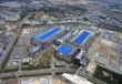
CTOnews.com learned that after the brand LOGO was fully renewed, TCL Huaxing Park Building and official website were also replaced with new LOGO.
▲ TCL Huaxing Park Logo upgrade
▲ TCL Huaxing Park Logo upgrade
▲ TCL Huaxing official website upgrade